
The home care website that converts: what the best agency sites have in common

Mark BatemanDirector of Web DevelopmentAugust 19, 2026
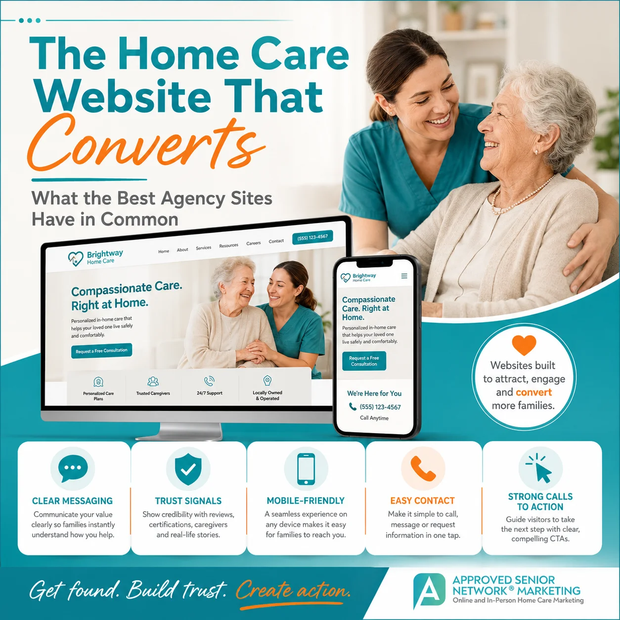
TL;DR: A high-performing home care website has three jobs: get found, build trust, and create action. Approved Senior Network uses those three jobs as the foundation of website strategy. A stressed family should be able to tell within seconds what you do, where you serve, why you may be trustworthy, and what to do next. The strongest sites make services specific, stack proof instead of adjectives, create separate paths for families and caregivers, use short lead forms, work well on mobile, and connect every page to a clear next step.
The ASN three-job framework
At Approved Senior Network, we evaluate home care websites against three jobs:
- Get found. Search engines, Maps, and AI-assisted search systems can access, understand, and connect the site to relevant services and locations.
- Build trust. Families quickly see evidence that the agency is credible, local, competent, and appropriate for their situation.
- Create action. Calling, texting, requesting care, downloading a guide, or scheduling a consultation feels obvious and easy.
A beautiful website can fail all three.
That is why home care website design should be evaluated as a marketing and conversion system, not simply a visual project.
Run the five-second homepage test
Open the agency homepage on a phone. Do not scroll.
In five seconds, can a stressed family member answer:
- Can you help me?
- Where do you provide care?
- Why should I trust you?
- What should I do next?
If one of those answers is missing, that is a higher priority than adding another animation, slider, stock photo, or decorative section.
Example: weak above the fold
Headline: "Care You Can Count On"
Subhead: "Compassionate solutions for every stage of life."
Button: "Learn More"
This sounds pleasant, but it gives the visitor very little usable information.
Example: stronger above the fold
Headline: "In-home care for older adults in Northern Virginia"
Subhead: "Personal care, companion care, dementia support, respite care, and overnight help for families who want a loved one to remain safely at home."
Buttons: "Call now" and "Request a care consultation"
Trust line: "Locally operated | Real client reviews | Care coordination seven days a week" - but only if each statement is accurate.
The second version answers the visitor's questions before asking for attention.
Give major services their own useful pages
One generic "Our Services" page is rarely enough for a growth-oriented site.
A strong service page should explain:
- Who the service helps
- The situations that lead families to consider it
- What the service actually includes
- What the service does not include when clarification matters
- How scheduling works at a high level
- How care starts
- Why the agency may be a good fit
- Frequently asked questions
- The next step
ASN service-page decision rule
Create a dedicated service page when the service:
- Is genuinely offered.
- Matters enough to the business to deserve search visibility.
- Has its own family questions or buying intent.
- Can support a complete, useful page without padding.
Do not create a separate page for every keyword synonym.
Build trust as a stack of proof
Families are deciding whether they can trust someone inside a loved one's home. One badge or testimonial cannot carry that entire decision.
ASN uses a trust stack:
Real people
- Leadership bios
- Team photography
- Caregiver information when appropriate
Real reviews
- Current, specific feedback
- Links to third-party review platforms when useful
Real process
- How care starts
- How caregivers are selected and supervised
- How scheduling changes are handled
- How families receive communication
Real difference
- A specialty, response model, training process, communication system, or other provable distinction
Real credentials
- Licenses, accreditations, memberships, awards, or affiliations only when current and relevant
Real expertise
- Helpful articles, guides, FAQs, authors, and source-supported explanations
The result should answer, "Why should I believe you?" without relying on adjectives.
Use the website to reduce uncertainty before the call
Families often arrive with questions they are not yet ready to ask aloud.
Examples:
- How much help does Mom actually need?
- Can someone stay overnight?
- What if Dad refuses care?
- Can care start after rehab?
- Who supervises the caregiver?
- What happens if the regular caregiver calls out?
- Does Medicare pay for this?
The website does not need to answer every scenario on every page. It should make the next logical answer easy to find.
For the larger content and visibility system, see what actually works in home care marketing now.
Keep lead forms short at the first step
A website visitor who is considering care does not need to complete an intake assessment before the agency has even said hello.
ASN first-contact form template
Use only the fields required to start a useful conversation:
- Name
- Phone
- Email, if needed
- City or ZIP code
- "Who needs care?" or a simple care-need field
- Preferred contact method, if operationally useful
Then collect detailed clinical, scheduling, payer, and household information later through the appropriate intake process.
Form decision rule
For every form field, ask:
Will the team use this information before the first human response?
If not, consider moving it to the next stage.
Make the phone number impossible to miss
On mobile, a phone number should be tap-to-call and visible without hunting through the footer.
Also decide what happens after the click.
The website experience is incomplete if:
- Calls go unanswered with no defined callback owner.
- Form submissions sit in an inbox.
- After-hours inquiries have no process.
- A chat tool collects messages nobody monitors.
Website conversion and intake operations are one system.
Treat caregiver recruiting as a second funnel
Families and caregivers are different audiences.
A caregiver candidate wants to know:
- Why should I work here?
- Where are the cases?
- What roles and schedules are available?
- What are the real requirements?
- How hard is it to apply?
- What happens after I apply?
Do not force job candidates through a family-facing website path.
A dedicated careers section should have its own message, calls to action, and mobile application flow.
Mobile performance is part of trust
Google recommends evaluating overall page experience rather than obsessing over one score. Core Web Vitals can help identify performance issues, but Google also notes that good scores alone do not guarantee top rankings.
For home care, the practical test is simpler:
- Can the visitor read the page without pinching and zooming?
- Can they tap the phone number easily?
- Does the menu work?
- Does the form submit?
- Do important headings and copy appear quickly?
- Are intrusive elements blocking the content?
Use PageSpeed Insights and Search Console as diagnostic tools, then test the actual site on real phones.
The 10-point home care website scorecard
Give each item 0, 1, or 2 points.
0 = missing 1 = present but weak 2 = clear and strong
- Homepage says what the agency does.
- Service area is visible early.
- Phone number and primary CTA are obvious.
- Major services have useful pages.
- Major service areas have useful pages when needed.
- Trust proof is specific and current.
- How care starts is explained.
- Mobile experience is easy to use.
- Family and caregiver journeys are separated.
- Forms and calls have a defined follow-up process.
A site scoring 12/20 does not need a new color palette first. It needs the missing fundamentals.
The website should support the home care marketing plan, not operate as a separate design project.
Frequently asked questions
How many pages does a home care website need?
There is no ideal count. Build enough pages to explain the agency, major services, meaningful service areas, proof, resources, careers, and next steps. Do not create pages only to hit a number.
What makes families leave a home care website?
Common causes include vague messaging, slow or cluttered mobile pages, hidden contact information, generic claims without proof, difficult forms, and pages that do not answer the visitor's actual question.
How often should a site be redesigned?
Redesign when the current system cannot support the business effectively. Many sites need better content, navigation, forms, speed, or trust signals rather than a full rebuild.
Should pricing be on the website?
If one number would be misleading, explain the factors that affect cost and give the visitor a direct path to get an accurate estimate. Payment and benefit claims should be sourced and reviewed carefully.
Primary sources
- Google Search: Understanding page experience: https://developers.google.com/search/docs/appearance/page-experience
- Google Search: Core Web Vitals: https://developers.google.com/search/docs/appearance/core-web-vitals
- Google Search: Creating helpful, reliable, people-first content: https://developers.google.com/search/docs/fundamentals/creating-helpful-content
- Google Search: SEO Starter Guide: https://developers.google.com/search/docs/fundamentals/seo-starter-guide